When you come across a website and it just feels right, that’s not by accident. That feeling is design psychology at work. The best websites don’t just look good, but instead guide users through a smooth and interactive experience. As someone who is currently diving into the world of web development and is passionate about designing, I have realized that understanding human behavior is just as important, if not more important, than understanding and writing code.
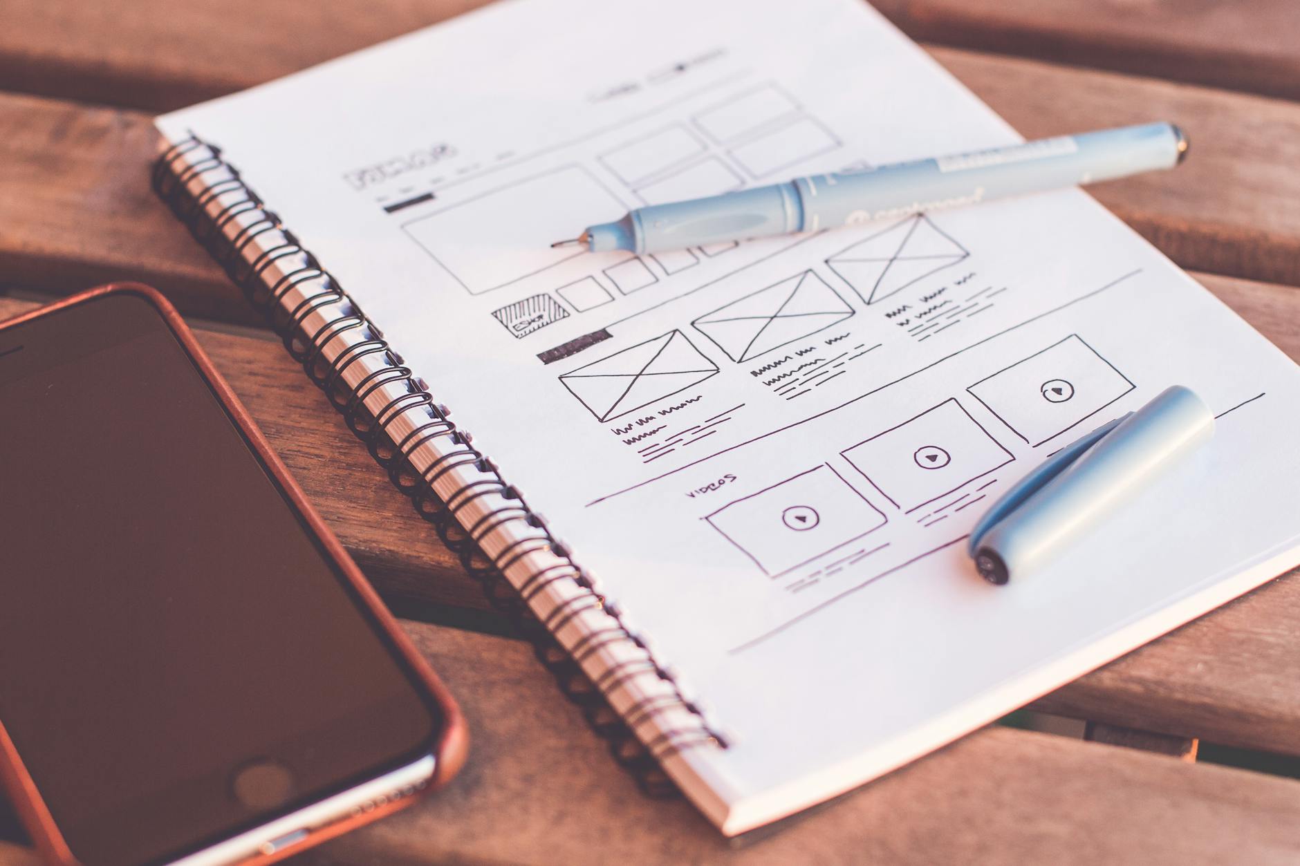
Visual Hierarchy
It is important to note that we, as humans, do not read websites like we read books. Instead, we scan through them. Most individuals follow a specific pattern when looking at a page. For instance, for text-heavy pages, people usually follow an F-pattern, scanning from the top to bottom and left to right. On the other hand, when looking at a page with less content and possibly more graphics, people generally use a Z-pattern, looking at the page by following a diagonal movement. Different headings strategically guide users’ attention as they are looking through a page. Particular H1, H2, H3 headings signal levels of importance. Making a style guide and using the same ones throughout the website helps create a uniform look.
In addition, designers use contrast to make key elements stick out. For example, placing dark text on a light background or using brightly colored buttons can attract the user’s attention more than a uniform appearance. Size is also a significant factor when looking at the typeface. Larger items, such as headlines or things that are bolded, get noticed first. Bold, colored, or animated call to actions (CTAs) help direct the user’s behavior. It is normal for a company to use their brighter brand colors to highlight CTAs such as a sign-up button or link that takes you to a different page. Directional cues also subtly guide users’ attention. These cues could be arrows or even images of people looking or shifting in a certain direction. Furthermore, designers must use grids and alignment to group related content and create a visual flow. They follow certain spacing guidelines that they keep throughout the site in order to ensure visual appeal. Spacing is highly important because certain elements placed too close to one another compete for attention. For instance, placing two right-aligned images directly on top of each other might create visual clutter and distract the user.
Color Psychology
Colors are not just for aesthetic purposes; they are expressive and evoke emotion. They are highly communicative when it comes to webpages. For instance, red often evokes a sense of urgency, energy, and excitement. This is why red is normally seen in the use of sales promotions or app notifications. Blue is one of the most commonly recommended colors for website design and branding because it conveys trust, calm, and security. For this reason, it is frequently used in technology, healthcare, and finance websites. The color green expresses growth, health, nature, and sustainability, making it a popular color for eco or wellness brands. Yellow often evokes feelings of optimism, attention, and warmth. However, it can be overpowering in excess, making it far less utilized. Purple often conveys luxury, creativity, and emotional depth. This is part of the reason why brands like Hallmark use purple. They want consumers to feel a sense of elegance yet sentimentality, aligning with their greeting cards and heartfelt content. Black and grey express sophistication, elegance, and authority. They are normally used in the fields of fashion and technology. Lastly, white gives a sense of cleanliness, simplicity, and minimalism and is common in modern UX designs.
Consistency of the color usage throughout a website builds brand identity and user trust. When the same colors are used across buttons, headings, and backgrounds, it creates a familiar experience for users and makes the brand feel more reliable and put-together. Tools such as Coolors and Adobe Color can help developers in building palettes. They offer features such as color harmony rules and accessibility checks based on images or mood boards, further simplifying the color palette building process.
Developers must not make the mistake of relying on color alone to convey meaning. It must always be paired with icons, labels, or changes in shape for users to be able to follow along. Take into consideration a user with color blindness. It would be highly difficult for them to navigate a website with dynamic color-based cues if there are no additional visual indicators. Cultural meanings of colors must also be taken into consideration. If a site has an international audience, different colors may convey different meanings. For example, the color white symbolizes purity and innocence in many Western cultures, while in parts of Asia, it is often associated with mourning and grief.
Spacing and Simplicity
Empty space between elements is known as whitespace, and it doesn’t necessarily need to be white. Whitespace increases content legibility and helps users focus more on individual sections. It also makes the design feel less overwhelming and adds a sense of clarity. Clutter is directly tied to cognitive overload and is important to consider when designing a webpage. Use the Rule of Thirds or the Golden Ratio to balance out a layout. The Rule of Thirds divides the screen into a 3×3 grid and places key elements along those lines. The ratio 1:1.618, known as the Golden Ratio, means that if you divide a line into two parts, the longer part divided by the shorter part is equal to the whole length divided by the longer part. In simpler terms:
If A is the longer part and B is the shorter part, then
(A + B) / A = A / B ≈ 1.618
Designers and web developers often use this ratio to guide layout decisions. It helps them determine how wide or tall a section should be, where to place images or text blocks, and how to divide a page into balanced columns.
It is important to chunk information into smaller, more manageable groups. Think about bullet points, cards, dropdowns. Many developers use containers, also known as content buckets, to group related content together. Visually, these containers might be separated by borders, background colors, or spacing to create contrast. This helps organize the page so users can easily scan and navigate without feeling overwhelmed.
Lastly, keep in mind that simplicity is powerful! Open up Google’s homepage. You will notice that it is mostly whitespace and just a single search box. This was an intentional design choice to keep the focus clear and friendly to all users.
Microinteractions
Microinteractions may not seem important at first glance, but they are very important. Microinteractions are the tiny, purposeful animations or feedback loops that guide or reward the user. One example might be a button that changes color when hovered or clicked. You may have come across a form field that turns red if filled out incorrectly or a progress bar that shows your completion status. Even on social media, when you tap the like button and it “pops” or turns red (that is a microinteraction!).
Good microinteractions normally provide feedback, like saying that your “file has been successfully uploaded!” They may show a system status. For instance, when the spinning wheel appears while something loads. They may also prevent errors, like when the Submit button is disabled until all fields are filled. Lastly, a good microinteraction enhances excitement. Maybe a confetti animation pops up when you have turned in an assignment.
Bad microinteractions include the overuse of animations, inconsistent behavior, and sometimes even providing no feedback. When animations are overused, the site can appear to be working slowly or feel less professional. Inconsistent behavior, such as the action of one button animating and the other not, can disrupt the experience. If users are not provided with feedback, they may be unsure if something they did actually worked.
Microinteractions often go unnoticed, which is the point. They enhance the flow of the page without drawing too much attention. Small additions of microinteractions can lead to greater user satisfaction. They strongly help humanize digital experiences by making people feel as though the site is responsive and alive.
To Conclude…
At the end of the day, good web design is about creating an experience that feels natural and engaging. It is not merely about making a site appear aesthetic or pleasing. Every color, font size, layout choice, and tiny animation plays a huge role in how someone interacts with a site. That is what is most important. Understanding the psychology behind design helps developers and designers make smarter choices that serve a purpose and don’t just look good. Whether it’s using whitespace to give the page room, building a consistent color scheme, or adding small feedback moments through microinteractions, every detail matters. When these pieces come together, users don’t just click. They stay. And that’s the goal!!
 Technically Curious
Leave a comment